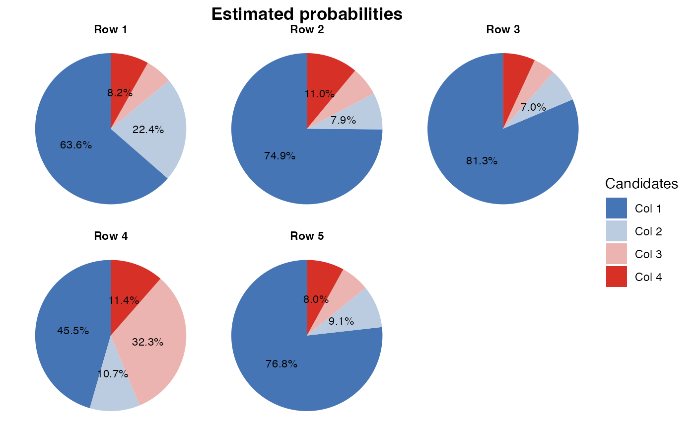
Plots the estimated probabilities as pie charts using ggplot2, one per row of the probability matrix.
Each slice displays its percentage label. For the parametric case, it does a weighted average over groups to retrieve the global probabilities.
# S3 method for class 'eim'
plot(
  x,
  title = "Estimated probabilities",
  legend_title = "Candidates",
  color_scale = NULL,
  min_pct = 3,
  pies_per_row = NULL,
  ...
)
Arguments
- x
An "eim" object.
- title
Title for the plot.
- legend_title
Title for the legend.
- color_scale
A vector of colors or a palette for the candidates.
- min_pct
Minimum percentage required to display a label.
- pies_per_row
Number of pie charts to display per row. Defaults to
ceiling(sqrt(G)), whereGis the number of groups.- ...
Additional arguments that are ignored.
Value
Returns a ggplot2 object representing the pie charts.
Examples
# \donttest{
sim <- simulate_election(
    num_ballots = 100,
    num_candidates = 4,
    num_groups = 5,
    ballot_voters = 40,
    num_covariates = 2,
    num_districts = 2,
    seed = 42
)
fit <- run_em(sim, maxiter = 5)

plot(fit, title = "Estimated probabilities", legend_title = "Candidates", min_pct = 7)

# }
# }